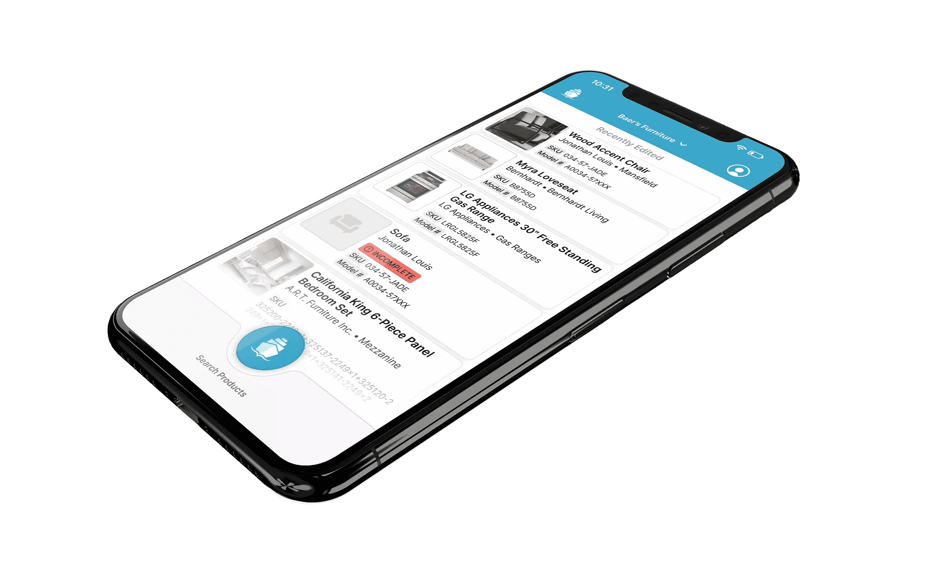
FNM Site Redesign
FNM Site Redesign
Rethinking the user experience to improve usability and credibility.
Rethinking the user experience to improve usability and credibility.
ROLE
UX/UI Designer
Web Designer
ASPECTS
Homepage browsing and navigation
Profile page design & customization system
TIMELINE
Q1 2026
DELIVERABLES
Figma prototypes & UX concept mockups
TEAM
Joe Craddock
Project Manager
Adam Coleman
Full-Stack Development
Tory Swensen
Frontend Development
Paul Fastner
Backend Development
CONTEXT
Defining the look, feel, and foundation of an ambitious new e-commerce platform
Defining the look, feel, and foundation of an ambitious new e-commerce platform
FurnishNearMe (FNM) is an in-development e-commerce platform built by FurnitureDealer.Net that allows consumers to discover, shop, and compare all of the furniture available at brick-and-mortar stores in their local area on a single site.
At its core, FNM runs on a comprehensive directory of thousands of furniture retailers across the US and Canada, cross-referencing shopper searches with their geographic location to surface relevant local product results.
The platform is also multifaceted in who it serves. Beyond consumers, FNM gives furniture retailers and manufacturers the ability to build out their directory profiles into full-fledged digital storefronts, and includes a B2B layer where manufacturers and retailers can discover each other, initiate buying relationships, and manage them directly through the platform.
I was brought on to establish a stronger visual direction and UX foundation for the platform's rough first-draft design, using two core page redesigns as a litmus test: the homepage and manufacturer profile page. Once approved, the direction would be handed off to the broader design and engineering teams to implement across the full site, with my input in an advisory capacity from that point forward.
FurnishNearMe (FNM) is an in-development e-commerce platform built by FurnitureDealer.Net that allows consumers to discover, shop, and compare all of the furniture available at brick-and-mortar stores in their local area on a single site.
At its core, FNM runs on a comprehensive directory of thousands of furniture retailers across the US and Canada, cross-referencing shopper searches with their geographic location to surface relevant local product results.
The platform is also multifaceted in who it serves. Beyond consumers, FNM gives furniture retailers and manufacturers the ability to build out their directory profiles into full-fledged digital storefronts, and includes a B2B layer where manufacturers and retailers can discover each other, initiate buying relationships, and manage them directly through the platform.
I was brought on to establish a stronger visual direction and UX foundation for the platform's rough first-draft design, using two core page redesigns as a litmus test: the homepage and manufacturer profile page. Once approved, the direction would be handed off to the broader design and engineering teams to implement across the full site, with my input in an advisory capacity from that point forward.


Basic anatomy of the FurnishNearMe platform.
Basic anatomy of the FurnishNearMe platform.
PROBLEM
The framework was there, the first impression wasn't
The framework was there, the first impression wasn't
FurnishNearMe's success as a platform hinges on one thing: gaining critical mass. The platform is a powerful framework, but without an active user base to enrich it, it's essentially an empty container. It needs retailers to claim and build out their directory profiles so that consumers can actually find accurate, useful local results when they search. Without that data, the whole system falls flat.
The rough draft design was struggling to attract and retain the users needed to make that happen. The core issues were threefold: it struggled to clearly communicate its value proposition, its visual design lacked the credibility and polish needed to earn user trust, and the user experience had too much friction and ambiguity to reliably guide users to the moment where the platform's value finally clicked. A redesign was clearly needed to remedy these problems.
FurnishNearMe's success as a platform hinges on one thing: gaining critical mass. The platform is a powerful framework, but without an active user base to enrich it, it's essentially an empty container. It needs retailers to claim and build out their directory profiles so that consumers can actually find accurate, useful local results when they search. Without that data, the whole system falls flat.
The rough draft design was struggling to attract and retain the users needed to make that happen. The core issues were threefold: it struggled to clearly communicate its value proposition, its visual design lacked the credibility and polish needed to earn user trust, and the user experience had too much friction and ambiguity to reliably guide users to the moment where the platform's value finally clicked. A redesign was clearly needed to remedy these problems.

Initial rough draft of the FNM homepage.
Initial rough draft of the FNM homepage.
PROJECT GOALS & SCOPE
Giving users a reason to trust, explore, and stick around
Giving users a reason to trust, explore, and stick around
The subgoals of this redesign all fed into one overarching objective: attract users and drive meaningful long-term adoption by giving them a reason to trust the platform and stick around long enough to reach that eureka moment of user activation.
To get there, the redesign needed to accomplish three things:
The subgoals of this redesign all fed into one overarching objective: attract users and drive meaningful long-term adoption by giving them a reason to trust the platform and stick around long enough to reach that eureka moment of user activation.
To get there, the redesign needed to accomplish three things:
Signal trust through design
Signal trust through design
Establish credibility and competency through a cleaner, more professional visual presentation, especially critical for FNM with it being a growing platform with no established reputation yet.
Establish credibility and competency through a cleaner, more professional visual presentation, especially critical for FNM with it being a growing platform with no established reputation yet.
Clarify and emphasize the value proposition
Clarify and emphasize the value proposition
Refine the site's messaging and copy to communicate what FNM is and does quickly, clearly, and compellingly enough to intrigue users to start exploring the platform on their own.
Refine the site's messaging and copy to communicate what FNM is and does quickly, clearly, and compellingly enough to intrigue users to start exploring the platform on their own.
Reduce friction in the user experience
Reduce friction in the user experience
Lower cognitive friction and improve navigability so users can move through the platform confidently and intuitively, reaching that eureka moment of user activation before their window of initial interest closes.
Lower cognitive friction and improve navigability so users can move through the platform confidently and intuitively, reaching that eureka moment of user activation before their window of initial interest closes.
CHALLENGES & CONSTRAINTS
Mediating visions, designing for everyone, and making it work with limited resources
Mediating visions, designing for everyone, and making it work with limited resources
This project came with a healthy set of constraints that required tactful handling at every stage:
This project came with a healthy set of constraints that required tactful handling at every stage:
Balancing competing stakeholder visions
Balancing competing stakeholder visions
Key stakeholders on the project held opposing creative tastes for the platform. My role became finding a direction that honored the goals behind both, landing somewhere between clean and competent on one end and bold and vibrant on the other.
The sharpest point of contention was the platform’s color scheme: one stakeholder was committed to the platform's original heavily saturated palette while the other favored the minimalist palette approach common in modern SaaS design. The challenge became applying the original palette in a way that felt professional and intentional rather than garish or overwhelming.
Key stakeholders on the project held opposing creative tastes for the platform. My role became finding a direction that honored the goals behind both, landing somewhere between clean and competent on one end and bold and vibrant on the other.
The sharpest point of contention was the platform’s color scheme: one stakeholder was committed to the platform's original heavily saturated palette while the other favored the minimalist palette approach common in modern SaaS design. The challenge became applying the original palette in a way that felt professional and intentional rather than garish or overwhelming.
Accounting for data variability, scalability, and modular customizability
Accounting for data variability, scalability, and modular customizability
The design needed to hold up across sparse and fully populated data states, accommodate significant variability in content length and density, and support a modular profile customization system with enough flexibility to be expressive but enough guardrails to prevent poor outcomes for less technical users.
The design needed to hold up across sparse and fully populated data states, accommodate significant variability in content length and density, and support a modular profile customization system with enough flexibility to be expressive but enough guardrails to prevent poor outcomes for less technical users.
Meeting the needs of three distinct user audiences
Meeting the needs of three distinct user audiences
Consumers, retailers, and manufacturers on the platform all interact with the same screens in different capacities, each bringing different needs, goals, and varying levels of digital literacy. The design had to work for all three while still tailoring specific screens toward the audience most likely to engage with them (e.g., homepage geared towards consumers).
Consumers, retailers, and manufacturers on the platform all interact with the same screens in different capacities, each bringing different needs, goals, and varying levels of digital literacy. The design had to work for all three while still tailoring specific screens toward the audience most likely to engage with them (e.g., homepage geared towards consumers).
Limited engineering resources
Limited engineering resources
A small engineering team with limited bandwidth pushed me to think creatively to find solutions that worked within existing platform frameworks rather than building new ones.
A small engineering team with limited bandwidth pushed me to think creatively to find solutions that worked within existing platform frameworks rather than building new ones.
Lean research infrastructure
Lean research infrastructure
No formal research budget and minimal direct access to real users meant being deliberate and resourceful about how insights were gathered and applied.
No formal research budget and minimal direct access to real users meant being deliberate and resourceful about how insights were gathered and applied.


Comparative analysis of the original FNM color scheme against modern SaaS color schemes.
Comparative analysis of the original FNM color scheme against modern SaaS color schemes.
RESEARCH & DESIGN PROCESS
Molding hypotheticals into something real
Molding hypotheticals into something real
Research & Discovery
Research & Discovery
I kicked off the project with an exploratory review of the existing FNM pages, focusing on the homepage and manufacturer profile page. I took inventory of the elements that would need to carry over into the redesign, identified UX deficiencies, and mapped pain points against insights gathered during discussions with stakeholders and the sales team. I also conducted a competitive analysis of adjacent platforms like Etsy, Wayfair, and Furniture.com, noting UX patterns that could translate well to our context.
I kicked off the project with an exploratory review of the existing FNM pages, focusing on the homepage and manufacturer profile page. I took inventory of the elements that would need to carry over into the redesign, identified UX deficiencies, and mapped pain points against insights gathered during discussions with stakeholders and the sales team. I also conducted a competitive analysis of adjacent platforms like Etsy, Wayfair, and Furniture.com, noting UX patterns that could translate well to our context.


Annotating pain points in the initial rough draft of the FNM homepage.
Annotating pain points in the initial rough draft of the FNM homepage.
Given the tight timeline and limited research resources, comprehensive user research wasn't feasible, and the platform was still new enough that there were very few existing users to pull from regardless. I worked with what I had.
Given the tight timeline and limited research resources, comprehensive user research wasn't feasible, and the platform was still new enough that there were very few existing users to pull from regardless. I worked with what I had.
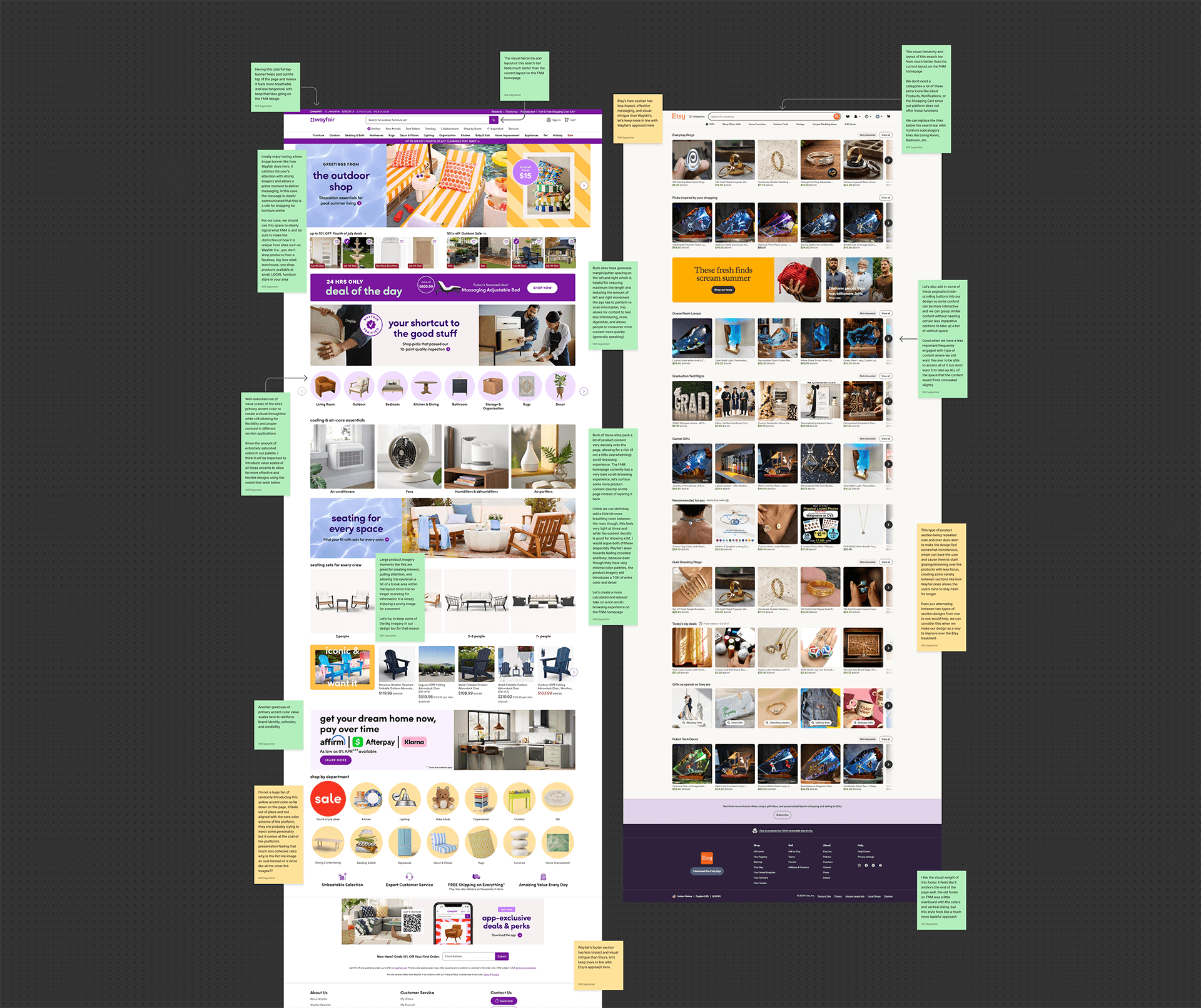

Identifying and evaluating UX patterns within competitor homepages.
Identifying and evaluating UX patterns within competitor homepages.
Before moving into design, I touched base with stakeholders to understand any design constraints around creative direction. Beyond preserving the original color scheme and not significantly altering the underlying page structure, stakeholders didn't have a strong initial vision. I decided the most efficient path forward was to put something tangible in front of them to get the conversation going rather than speculating about hypothetical designs. It's easier to point to a real design and say what you do and don't like about it than to critique something that doesn't exist yet.
Before moving into design, I touched base with stakeholders to understand any design constraints around creative direction. Beyond preserving the original color scheme and not significantly altering the underlying page structure, stakeholders didn't have a strong initial vision. I decided the most efficient path forward was to put something tangible in front of them to get the conversation going rather than speculating about hypothetical designs. It's easier to point to a real design and say what you do and don't like about it than to critique something that doesn't exist yet.
Initial Concepting & Direction Validation
Initial Concepting & Direction Validation
I skipped wireframing on this project. During my exploratory review I had already validated that the existing page flows were sound and didn't require structural changes, so the focus shifted entirely to improving the visual design, messaging clarity, information hierarchy, and scannability.
I created a first pass of the homepage redesign to use as a style exploration, making changes aimed at addressing the pain points identified during research. This included a redesigned hero section with clearer visual communication of the platform's concept, a more calculated use of the original color palette, and significantly increased content density that surfaced more product content and navigation options upfront to promote flatter, more efficient navigation.
I skipped wireframing on this project. During my exploratory review I had already validated that the existing page flows were sound and didn't require structural changes, so the focus shifted entirely to improving the visual design, messaging clarity, information hierarchy, and scannability.
I created a first pass of the homepage redesign to use as a style exploration, making changes aimed at addressing the pain points identified during research. This included a redesigned hero section with clearer visual communication of the platform's concept, a more calculated use of the original color palette, and significantly increased content density that surfaced more product content and navigation options upfront to promote flatter, more efficient navigation.


First iteration of homepage redesign used as a style exploration.
First iteration of homepage redesign used as a style exploration.
I brought this style exploration to stakeholders for feedback, expecting critiques and using the conversation to calibrate on direction. The key takeaways were that the design felt too removed from the original color palette, the pseudo-3D hero graphics read as too busy and complex, and certain features I had proposed such as social reactions and commenting on retailer announcement posts were determined to be too technically expensive to implement at this stage. The verdict was clear: the design needed to be simpler, cleaner, and more expressive.
I brought this style exploration to stakeholders for feedback, expecting critiques and using the conversation to calibrate on direction. The key takeaways were that the design felt too removed from the original color palette, the pseudo-3D hero graphics read as too busy and complex, and certain features I had proposed such as social reactions and commenting on retailer announcement posts were determined to be too technically expensive to implement at this stage. The verdict was clear: the design needed to be simpler, cleaner, and more expressive.
Homepage Design & Stakeholder Alignment
Homepage Design & Stakeholder Alignment
Armed with clear, concrete feedback, I moved into a focused second pass of the homepage redesign. This iteration addressed all prior feedback and introduced several meaningful improvements.
Armed with clear, concrete feedback, I moved into a focused second pass of the homepage redesign. This iteration addressed all prior feedback and introduced several meaningful improvements.


Second iteration of homepage redesign.
Second iteration of homepage redesign.
I adopted Poppins as the site's primary typeface for a cleaner, more modern feel. I reintroduced the full original color palette more boldly and intentionally. I replaced the detailed pseudo-3D graphics with large, flat icons and geometric shapes to keep the focus on product imagery. I also replaced the hero button cluster with a new Shop by Category bento grid that simultaneously reinforced the platform's value proposition and consolidated all primary category entry points in one prominent, visually engaging section. Features that were beyond engineering's current capabilities were removed in favor of a design that felt complete without them.
I adopted Poppins as the site's primary typeface for a cleaner, more modern feel. I reintroduced the full original color palette more boldly and intentionally. I replaced the detailed pseudo-3D graphics with large, flat icons and geometric shapes to keep the focus on product imagery. I also replaced the hero button cluster with a new Shop by Category bento grid that simultaneously reinforced the platform's value proposition and consolidated all primary category entry points in one prominent, visually engaging section. Features that were beyond engineering's current capabilities were removed in favor of a design that felt complete without them.


Style guide outlining the approved homepage design direction.
Style guide outlining the approved homepage design direction.
The second pass was approved with virtually no notes, a clear sign that stakeholders and I were now fully aligned on direction. From there I handed the design off to engineering and provided implementation support, auditing the live site to catch and communicate any inconsistencies in translating the design to code.
The second pass was approved with virtually no notes, a clear sign that stakeholders and I were now fully aligned on direction. From there I handed the design off to engineering and provided implementation support, auditing the live site to catch and communicate any inconsistencies in translating the design to code.
Manufacturer Profile Page Design
Manufacturer Profile Page Design
With the homepage approved and implementation underway, I turned my attention to the manufacturer profile page, carrying the established visual system forward while adapting it to the unique needs of this page.
I started with the foundational elements: a hero section with a banner image and profile header containing core business information, quick CTA links, tab navigation to switch between their Products and About pages, and context-sensitive controls that surfaced backend editing tools for users associated with the profile's account.
With the homepage approved and implementation underway, I turned my attention to the manufacturer profile page, carrying the established visual system forward while adapting it to the unique needs of this page.
I started with the foundational elements: a hero section with a banner image and profile header containing core business information, quick CTA links, tab navigation to switch between their Products and About pages, and context-sensitive controls that surfaced backend editing tools for users associated with the profile's account.

Profile hero section and context-sensitive profile header variants.
Profile hero section and context-sensitive profile header variants.
With the foundational structure in place, I turned my attention to the customizable content modules that would populate the body of the profile. To inform what kinds of modules should be possible, I studied the existing websites of two furniture manufacturers with strong online presences, Bedgear and Polywood, analyzing the types of sections, media, and messaging they used to communicate their brand narrative.
With the foundational structure in place, I turned my attention to the customizable content modules that would populate the body of the profile. To inform what kinds of modules should be possible, I studied the existing websites of two furniture manufacturers with strong online presences, Bedgear and Polywood, analyzing the types of sections, media, and messaging they used to communicate their brand narrative.


Customizable content modules for manufacturer profiles pages.
Customizable content modules for manufacturer profiles pages.
I used those observations to develop a standardized kit of content modules that any manufacturer could mix and match to build an impactful profile on the platform, then mocked up example FNM profiles for both Bedgear and Polywood to demonstrate the concept in practice.
I used those observations to develop a standardized kit of content modules that any manufacturer could mix and match to build an impactful profile on the platform, then mocked up example FNM profiles for both Bedgear and Polywood to demonstrate the concept in practice.
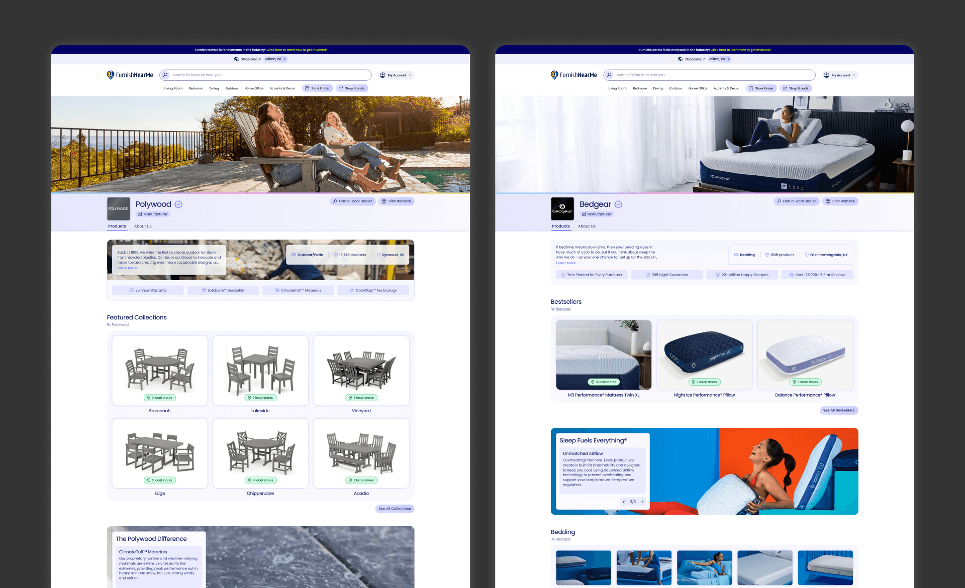

Profile page mockups for Polywood and Bedgear.
Profile page mockups for Polywood and Bedgear.
Upon reviewing the design, the PM expressed general enthusiasm but raised concerns about how feasibly manufacturers would be able to create and manage these content modules on the backend. It was agreed that the right next step was to concept the backend profile customization UX to validate the approach.
Upon reviewing the design, the PM expressed general enthusiasm but raised concerns about how feasibly manufacturers would be able to create and manage these content modules on the backend. It was agreed that the right next step was to concept the backend profile customization UX to validate the approach.
Backend Profile Customization UX Concepting
Backend Profile Customization UX Concepting
The central question in designing the backend customization system was how much freedom to give users. Too much and manufacturers could create cluttered, poorly structured profiles that undermined the consumer experience. Too little and the system would feel restrictive and frustrating for users who wanted more robust creative control over how they represented their brand.
I started by concepting a lean backend system for creating, customizing, and managing content modules, threading the needle between keeping the build simple for engineering and giving users enough customization to create something effective. This established the baseline interaction mechanics that would be consistent across all versions of the system. From there I diverged into two distinct approaches, one high autonomy and one low autonomy, differing in how much control users had over the placement, quantity, and types of content modules on their profile.
The central question in designing the backend customization system was how much freedom to give users. Too much and manufacturers could create cluttered, poorly structured profiles that undermined the consumer experience. Too little and the system would feel restrictive and frustrating for users who wanted more robust creative control over how they represented their brand.
I started by concepting a lean backend system for creating, customizing, and managing content modules, threading the needle between keeping the build simple for engineering and giving users enough customization to create something effective. This established the baseline interaction mechanics that would be consistent across all versions of the system. From there I diverged into two distinct approaches, one high autonomy and one low autonomy, differing in how much control users had over the placement, quantity, and types of content modules on their profile.
Demo of base customization system UX with side-by-side view of the profile page being edited.
Demo of base customization system UX with side-by-side view of the profile page being edited.
The first version was a flexible system where users could create any number of any type of content module and freely reorder them throughout their profile. This offered maximum creative freedom but introduced some risk of manufacturers deprioritizing key consumer-facing modules like product listings in favor of excessive promotional content.
The first version was a flexible system where users could create any number of any type of content module and freely reorder them throughout their profile. This offered maximum creative freedom but introduced some risk of manufacturers deprioritizing key consumer-facing modules like product listings in favor of excessive promotional content.
Flexible system for content module management.
Flexible system for content module management.
The second version was a restricted system where designated content slots interspersed between core blocks determined where and how many of each module type could be placed, with a cap on duplicate module types as an additional guardrail. This approach sacrificed some user autonomy in exchange for a more consistently structured and consumer-friendly profile experience.
The second version was a restricted system where designated content slots interspersed between core blocks determined where and how many of each module type could be placed, with a cap on duplicate module types as an additional guardrail. This approach sacrificed some user autonomy in exchange for a more consistently structured and consumer-friendly profile experience.
Restricted system for content module management.
Restricted system for content module management.
I presented both approaches to the PM, who responded positively but noted that deeper conversations with engineering would be needed before committing to a direction.
Shortly after this, shifting priorities within the company led to engineering resources being reallocated to other projects, and the PM adjusted focus accordingly. This project was subsequently put on hold until further notice, and I moved on to other projects in the meantime.
I presented both approaches to the PM, who responded positively but noted that deeper conversations with engineering would be needed before committing to a direction.
Shortly after this, shifting priorities within the company led to engineering resources being reallocated to other projects, and the PM adjusted focus accordingly. This project was subsequently put on hold until further notice, and I moved on to other projects in the meantime.
FINAL DELIVERABLES
A design direction delivered and ready to build toward
A design direction delivered and ready to build toward
The final deliverables were interactive high-fidelity Figma prototype files for the approved homepage design, the manufacturer profile page design, and UX concept mockups for the backend profile customization system. These files represented everything engineering needed to build the homepage, which is now live, and everything they would need to implement the remaining designs when the project resumes.
The final deliverables were interactive high-fidelity Figma prototype files for the approved homepage design, the manufacturer profile page design, and UX concept mockups for the backend profile customization system. These files represented everything engineering needed to build the homepage, which is now live, and everything they would need to implement the remaining designs when the project resumes.
REFLECTION & OUTCOMES
Show don't tell and learning to find the middle ground
Show don't tell and learning to find the middle ground
If I were given the opportunity to continue work on this project, my next step would’ve been fleshing out the backend customization system into full, production-ready UX deliverables and handing them off to engineering alongside the manufacturer profile page for implementation, staying closely involved to oversee execution and address any translation issues that came up along the way.
From there I would have carried the approved visual system over to the retailer profile page, a related but distinct design challenge that requires a more robust product browsing and shopping experience within the profile itself, beyond what the manufacturer version needed.
If I were given the opportunity to continue work on this project, my next step would’ve been fleshing out the backend customization system into full, production-ready UX deliverables and handing them off to engineering alongside the manufacturer profile page for implementation, staying closely involved to oversee execution and address any translation issues that came up along the way.
From there I would have carried the approved visual system over to the retailer profile page, a related but distinct design challenge that requires a more robust product browsing and shopping experience within the profile itself, beyond what the manufacturer version needed.
Reflection
Reflection
This project sharpened two things in particular for me. The first was learning how to navigate conflicting stakeholder visions without losing the thread of a cohesive design direction. This required understanding the goals behind each perspective rather than just splitting the difference, and finding a direction that could properly satisfy both parties.
The second was a reinforced appreciation for the value of tangible design artifacts over abstract discussion. Not everyone can visualize a design from a conversation alone, and this project reminded me that a rough mockup put in front of the right people will always move things forward faster than an elaborate explanation. Real designs give people something concrete to react to. Hypotheticals don't.
This project sharpened two things in particular for me. The first was learning how to navigate conflicting stakeholder visions without losing the thread of a cohesive design direction. This required understanding the goals behind each perspective rather than just splitting the difference, and finding a direction that could properly satisfy both parties.
The second was a reinforced appreciation for the value of tangible design artifacts over abstract discussion. Not everyone can visualize a design from a conversation alone, and this project reminded me that a rough mockup put in front of the right people will always move things forward faster than an elaborate explanation. Real designs give people something concrete to react to. Hypotheticals don't.